
Why Consistent Light Colour Temperature Matters More Than You Think
In the world of luxury interiors, it’s the little things that elevate a space from simply stylish to truly stunning. One of the most important—and most overlooked—details is light colour temperature. When done right, it’s seamless. When done wrong, it’s all you can see.
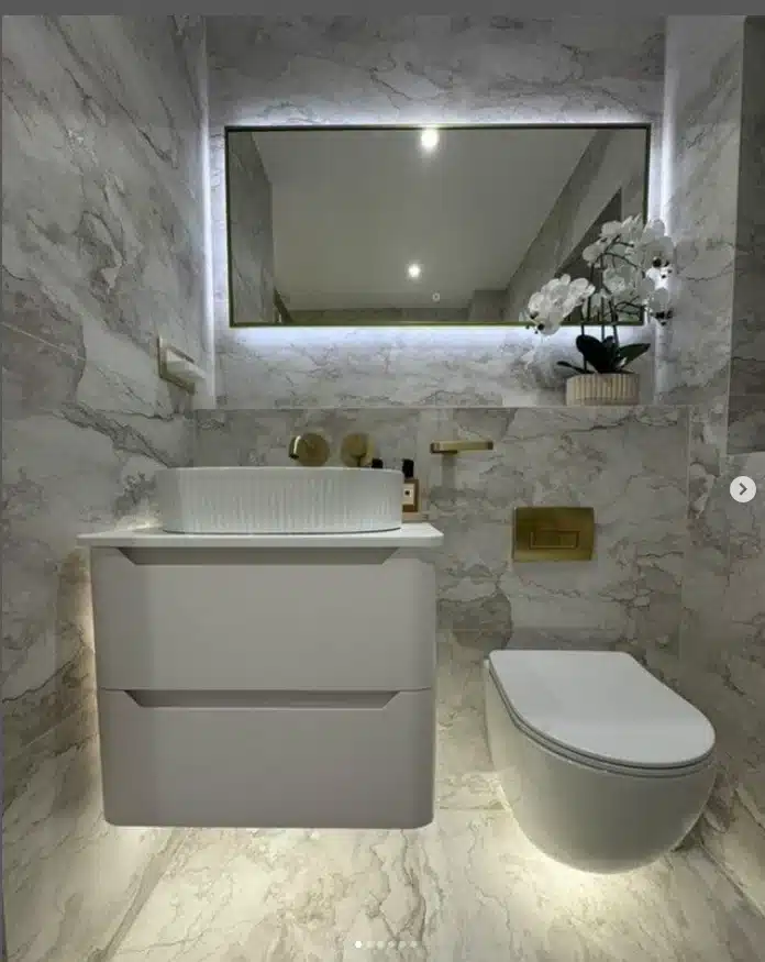
The inspiration for this post came from a photo I spotted on Instagram: a gorgeous bathroom, beautifully fitted, clearly high-end. But something felt… off. One half of the room had a soft, golden glow, while the other was washed in a stark, cool white. The culprit? Mismatched light colour temperature. And it completely disrupted the feel of the space.
What Is Light Colour Temperature?
Light colour temperature is measured in Kelvins (K), and it defines how “warm” or “cool” a light source appears. Lower values, around 2700K to 3000K, produce a warm, amber-toned light—cosy, inviting, perfect for living spaces and bedrooms. See the yellow glow under the toilet and basin? Higher values, like 4000K or more, give off a cooler, whiter light that’s commonly used in task-oriented or commercial environments. The light behind the mirror is probably 4000K +
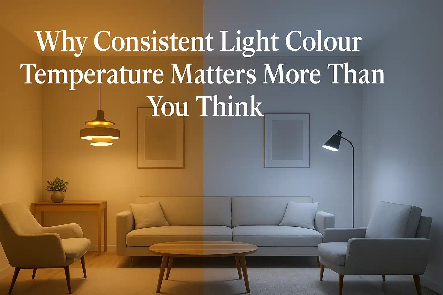
In residential design, choosing the right light colour temperature is crucial. But just as important is consistency. Using different colour temperatures in the same room—say a warm 2700K fitting next to a cool 4000K downlight—creates a jarring visual clash that the brain immediately picks up on.
Why Consistency in Light Colour Temperature Matters
When the light colour temperature varies across a space, it disrupts the entire design. Surfaces reflect light differently, materials change tone, and the room’s atmosphere becomes unsettled. A rich oak finish might feel warm and luxurious under one light but washed out and dull under another.
Consistent light colour temperature, on the other hand, ensures everything in the space works together. It enhances natural textures, flatters finishes, and helps create a cohesive, harmonious environment—especially important in bathrooms, kitchens, and open-plan living areas.
Creating Beautiful Spaces with Thoughtful Lighting Design
Whether you’re designing a single room or a whole home, maintaining a consistent light colour temperature is one of the most effective ways to elevate the feel of the space. It’s a subtle shift with powerful results.
In automated homes, this becomes even more important. With scene-based lighting control, your lighting can adapt to the moment—bright and energising for the morning, soft and atmospheric in the evening—all while keeping the light colour temperature constant. It’s smart, seamless, and beautiful.
With tunable white lighting becoming more popular (we’ll write a post about this and dim-to-warm soon), it’s tempting to flex between colour temperatures. But unless it’s done with intention—like mimicking circadian rhythms—it’s better to select a single, well-chosen light colour temperature and stick with it. Your design will thank you.
Final Thoughts
Light colour temperature might seem like a technical detail, but it’s actually one of the most emotionally impactful aspects of lighting design. When it’s consistent, it fades into the background—letting your materials, textures, and architecture shine.
So next time you’re planning a lighting scheme—or scrolling through Instagram—keep an eye on the glow. A tale of two Kelvins can undo even the most beautiful of designs.